The Conversion Platform that helps you get more
Leadoo turns your passive website traffic into active leads.
Identify, activate, nurture and ultimately convert more of your website visitors with Leadoo.


As used by…
Leadoo, SALESmanago, and Thulium are now one family.
Join 3,000+ successful customers who unlock profit across every channel and stage of the customer lifecycle.
Discover more about our integration here.
The Best Website Conversion Platform
We activate your passive website visitors and make it easy for them to convert
Leadoo builds the bridge between your visitors’ needs and what you offer. This improved onsite customer experience leads to conversion rate increases of up to 41% on average. Check out customers success stories of exactly this here.
Conversion Kit
Conversion tools which bring immediate results
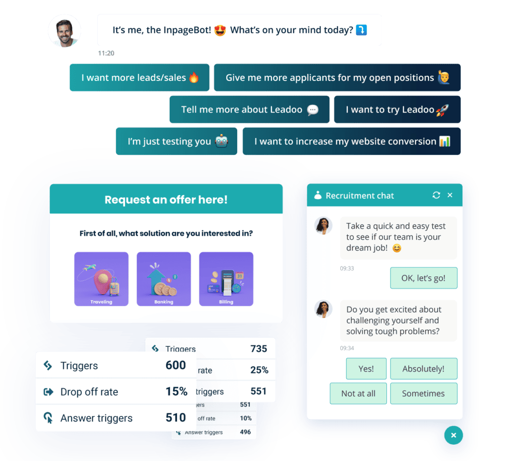
Conversion Kit has all the tools you need to convert your website visitors, through our mix of visual, inpage, AI and chatbot solutions.
Conversion Kit allows you to supercharge conversions, and turn your website into your best performing sales channel.

Conversion Insights
See every interaction with actionable insights
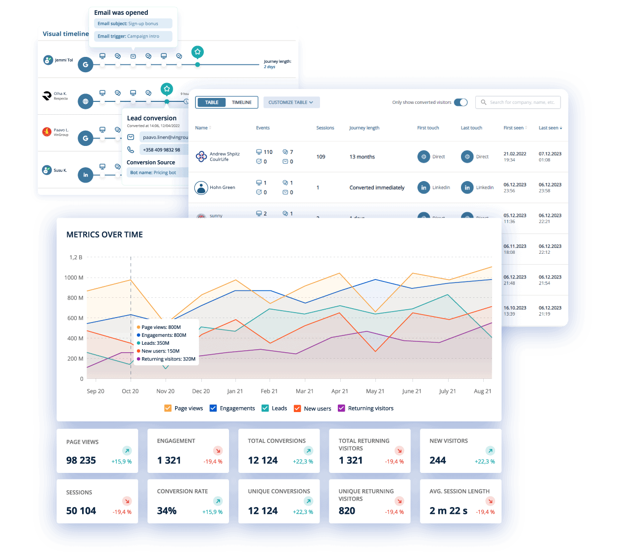
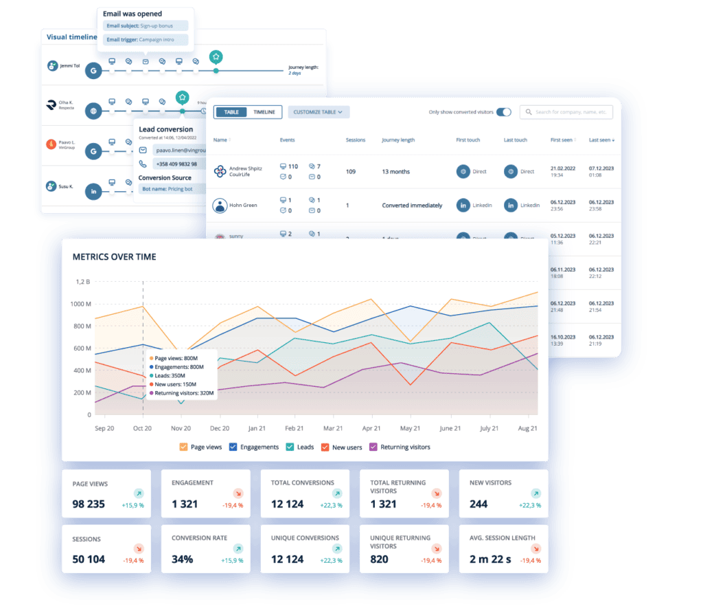
Conversion Insights allow you to see every interaction happening on your website, and make proactive decisions to gain more of the market. 🕵️
Understand your website visitors behaviour, map their buying journeys, see where they work, attribute what traffic channels work for you, and understand how different buyers use your site.
Conversion Experts
Experts always available
Our Conversion Experts are on hand to help you make the most of your solutions. They’ll analyse your results, optimise your solutions and make sure your tools are performing. Their expertise has earned us multiple “The Easiest to do Business with” and “Best Support” G2 badges.
The best part? Time with our experts is included in all paid plans.
Bridge the gap between Marketing & Sales with Leadoo
See how Leadoo’s done it for…
Our customers use Leadoo for…

Recruitment
Activate visitors to increase your candidate pool, and qualify and shortlist candidates automatically using Leadoo’s Recruitment Bot.

Lead generation
Engage your visitors to actively convert them using contextual and personalised discussions – whilst qualifying them and gaining insight into their needs.

Customer service
Automate your customer service, and provide real-time assistance for the cases that need it the most.
What’s new with Leadoo? 👇
-
 Behind Leadoo, Company Updates
The Why Behind Leadoo’s New Pricing
We recently updated our pricing and packages at Leadoo. Here, we’re laying out what’s changed, why, and what that means…
Read more -
 AI, Product Updates
AI Bot Builder
Create Complete Leadoo Bots in Minutes At Leadoo, we’re always looking for ways to make conversion-driving experiences faster, smarter, and…
Read more -
 Company Updates, Leadoo Marketing Technologies
Leadoo Forms New SLT To Kick Off 2026
February 18th, 2026 – Helsinki Leadoo has entered 2026 with renewed momentum, announcing a new Senior Leadership Team (SLT) designed…
Read more


