UX, or user experience, is swiftly becoming one of the key parts of any company’s marketing strategy. No longer is it good enough to be ‘good at marketing’, now, the companies offering the customer the best experience are those that win 👑
User Experience (UX): What is it?
User experience is, according to the Interaction Design Foundation, defined as the way in which your customers experience and engage with your company. This can be both digital and in-person, ranging from the experience a customer has in a physical shop to the experience they have when they visit your site. These experiences, in their entirety, is what helps to create the brand and identity of your company in the customers mind – and so by creating a positive experience at every interaction, you’re helping to create a positive image of your brand.
And it’s not just each interaction, happening independently of the others, that creates your user’s experience. UX designers do work with the product, but their focus is on the whole process; from introduction, to feedback on the product, to help and support customers might need in using it. UX designers deal in experiences rather than products, as they recognise that the experience is where a customer sees true value and differentiation.
Take the iPhone as a prime example of a UX-focused product. The User Experience is its Unique Selling Point and what differentiates it from its competing products. The customer’s experience starts on their site, with its user-friendly navigation and support at every turn, or in their stores with their church-esque stature and their never ending supply of helpful and knowledgeable store assistants all matching in dress and singing from the same hymn sheet (as, of course, a choir should). This consistent, supported user experience is part of the reason why Apple is as much of a global success as it is, and consequently enjoys some of the most loyal customers across the world.
What makes a good user experience?
What makes a good user experience is to some extent determined by the customer or prospect, and is mostly driven by their needs and expectations. Often, customers visiting B2C sites, for example, know what they want – and they want to find it quickly. To provide a good user experience for these customers, the business can focus on providing user-friendly, intuitive navigation, product selection help (either with AI or by directing customers to a real-time support agent), and a smooth checkout experience. The aim of the game is always to make it as easy as possible for that customer to buy something.
With B2B, especially in wide-reaching industries such as SaaS, customers quite often aren’t actually sure what they want specifically. They know they have a problem, or a pain point, but aren’t sure exactly what is available or is able to plug the gap and solve the problem for them. Businesses can again make use of product selector style bots on their site, and ask qualifying questions to understand each individual customer’s needs so these needs can be addressed with a product suggestion, or by putting them in contact with a salesperson from the business.
And both of these types of customer won’t hang about if your page load speed is slow, your interactive elements don’t work effectively, or your website isn’t user-friendly. It works the same way for any in-person experience too – take our Apple example from earlier, if you visited the Apple store and there was nobody there to provide swift assistance, or the tech in the shop didn’t work, or the shop was difficult to move around, then you’re probably not going to hang about for long. Speed of service, or page load speed on a website, is crucial to customers staying long enough to buy something. On websites, bounce rates increase by over 20% when the page loading time is slowed by just a few seconds.

A visitor’s user experience doesn’t have to just be when they’re buying something – consider potential candidates for any given vacancy advertised on your site. Looking for candidates for a role is largely the same process as sales, and these visitors should be treated as such. The experience they have of navigating your site, the language and tone, imagery and level of technology and interactivity used will all influence their first impressions, and may be an influencing factor when they make their decision to apply for, or even accept, a job working with you.
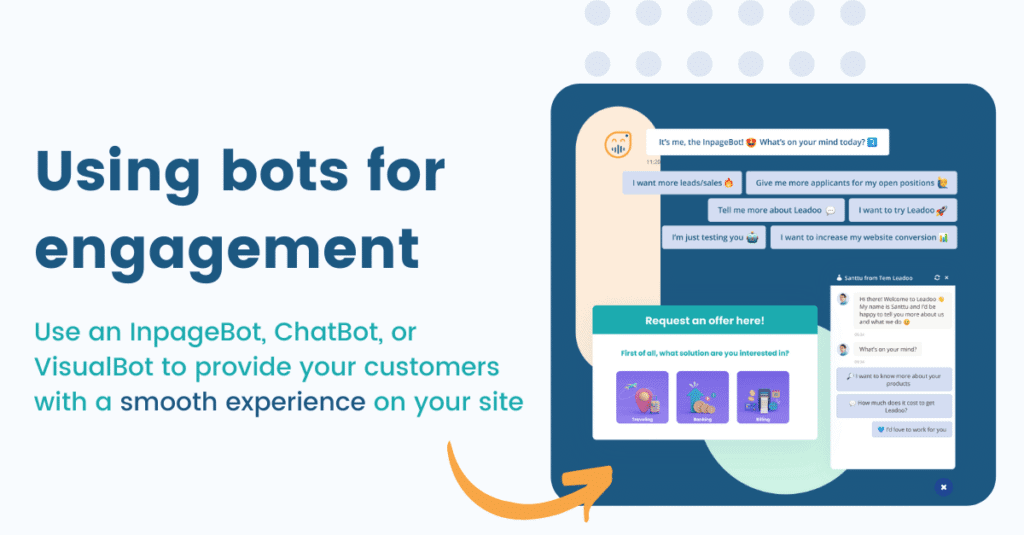
Interactive elements, such as Leadoo’s InpageBot, help to activate and engage your visitors, provide them with a consistent, on-brand experience, qualify their needs, and send them to the relevant team automatically without the need for manual movement of leads. In recruitment, they can even be used to ask questions to determine experience and cultural fit, rather than relying on the hiring manager sifting through CVs for hours on end. The best thing about the bots is that they’re the lightest tech on the market, with only a nominal effect on page load speed, meaning your ranking with Google won’t be affected by poor technical performance.
Conversion Rates: why they matter
Conversions are any desired action a visitor takes on your site. These can be divided into hard conversions (those which are directly linked to revenue or sales), and soft conversions (those which aren’t directly linked to a sale but do give us a really good insight into the customers’ intentions and how far along the buying journey they are).
You can calculate your conversion rate by using the below formula:

Or, if you’re like us and you like it when technology does things for you, you can use our free Conversion Rate Calculator to work your conversion rate out.
Conversion rates are an important metric for marketers to monitor and embed in their strategy – they provide a measure for your return on the efforts you have put into driving traffic to your site. Traffic only tells you how many people visit, not what they do when they get there. 98% of the people who visit your site, on average, leave without converting – which is a huge waste of time and money spent on driving people there in the first place.
5 top UX tips for increasing your conversions on your site
1. CTAs and placement of CTAs
Calls to action (or CTAs) are providing the customer with a way to act on their decision to purchase. These can be for a soft conversion, such as signing up to a newsletter, or for a hard conversion, such as booking a demo or a discovery session.
The availability, wording, and placement of CTAs all have an impact on how likely they are to convert customers. The general rule is the more CTAs the better – although too many and your customer is likely to feel overwhelmed as it’s something akin to standing in the middle of 30 screaming car salespeople all vying for your attention. 2-3 per view that the customer has is plenty – any more and you may risk overloading the customer, or making them feel extra guarded once they realise it’s a sales pitch.
In terms of wording for your CTAs, this very much depends on your customers and what works best for them. Here, A/B testing can come in handy, and can help you work out what works best. Our conversion experts often find that different CTAs work better on particular pages, and so these tests help you to determine which you should use.
2. Make it mobile-friendly
This one almost goes without saying. We are, after all, in 2022. We are a generation of people on the move, and so a large part of our work is done via our phones. The same is true for your potential customers – reading and information gathering during their decision making process can be done on the go, and you need to be able to facilitate that if you want to be considered. In addition, mobile optimisation improves the experience for the customer, and helps with SEO and ranking.
Making sure your site is optimised for mobile allows you to make the most of customers visiting from all kinds of devices, and ensures you don’t miss out on converting traffic coming from different places, at different times.
3. Make it easy to navigate
You want your customers to find what they need without hurdles or barriers preventing them from doing so. Customers who are committed to buying generally have a low tolerance for jumping through hoops to get what they want. Customers who haven’t committed to buying have an even lower tolerance, if at all, and so it’s important that customers are able to find what they need without hindrance.
This can come back to navigation across the site. Is your product packaged in a way that makes sense for the customer? Can they easily identify which products or services are for them, and which aren’t? If not, then they’re unlikely to spend a long time searching, instead choosing to find what they need from your competitor (whose site is much easier to navigate, and makes it immediately obvious to the customer what they need).
One solution for improving navigation is to implement bots on the site which work to quickly understand what each customer needs and providing them with a direct navigation to the relevant page, or collecting their information to pass onto a sales team if they are ready to proceed to purchase.
4. Activate and engage with interactive elements
The amount of time your customers actually spend on your site can be increased by providing interactive elements to engage them. This could be in the form of a video, clickable imagery, or a bot strategically placed within the content.
Engagement also helps you to work out what each visitor is looking for, their intentions, and where in the buying process they’re at. Using chatbots to qualify customer needs and help them to navigate through to what they need provides a positive, personalised experience for the customer and increases the likelihood that they’ll convert.
5. Check your technical performance
Your technical performance affects how your visitors experience your page. Page load speed is a contributing factor to having a high bounce rate – we’re not very patient as a species – and so if your site takes too long to load pages up, customers will likely get frustrated and look to your competitors for what they need.
You can run a Google Lighthouse check and check the technical performance of your page, including your page load speed. We’ve also written an article on technical performance and SEO, and how Leadoo’s solutions are built with this in mine.
Key Takeaway: CRO and UX go hand in hand
Without users, you have no conversions, so you drive traffic to your site. But if those people are having a terrible experience or can’t find what they need, they’re not going to stay long enough to convert. User experience is therefore absolutely critical for helping to increase conversions and ensuring that prospects stay interested and don’t bounce.


