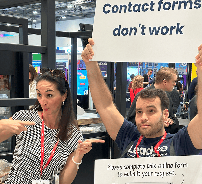
Ah, yes. The good old contact form. They’ve been around for decades, coming in all different shapes & sizes.
Unfortunately, for many websites, the journey set out for site traffic to convert to a tangible lead is often long and ugly. And contact forms are at the centre of that.
Hubspot’s blog says a good contact form should convert around 2-5%. Most of us aren’t satisfied with such a low conversion rate, so we (as savvy marketers) turn to other methods to help us be more proactive, improve end-user experience, and maximise conversions.
So without further ado, here’s 8 good reasons why you should say bon voyage to your old contact forms.
Reason #1 – Contact forms have no visual appeal
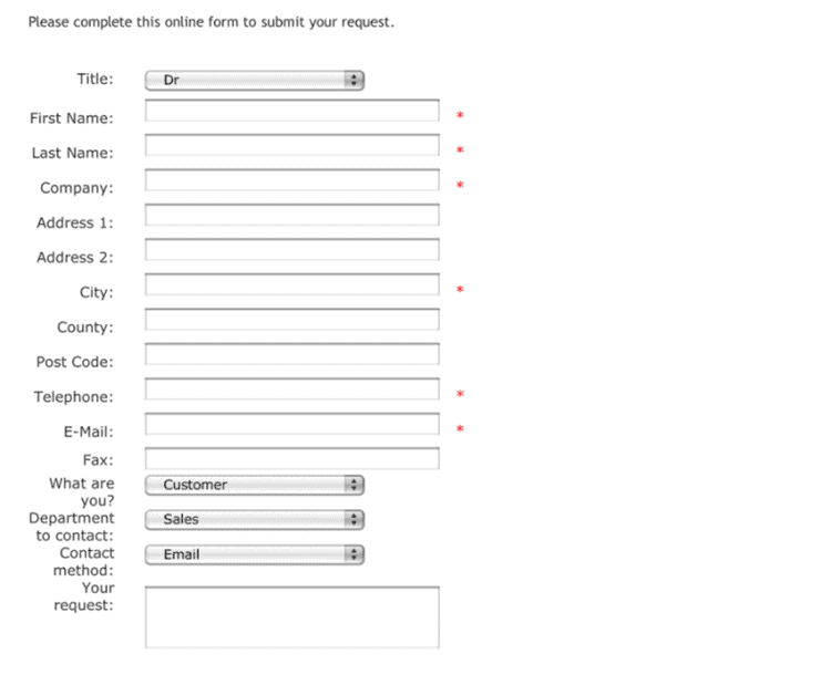
Many contact forms are U-G-L-Y.
If you’ve been on the developing end, you know how hard it is to doll up a contact form. Ask any marketer that’s worth their weight in gold and they’ll tell you that aesthetics are key when it comes to keeping site traffic engaged.
The reality is most contact forms look like they were dropped onto the page with no real care, visually overwhelming those that care to give it a second look.
They also often do not look like the rest of the site in any way, sticking out like a sore thumb, and creating brand inconsistency. Learn more about How to Increase Conversion Rates Using Visual Bots
Reason #2 – Most contact forms are too long
In today’s digital landscape, people value two things above all else. Significance and convenience.
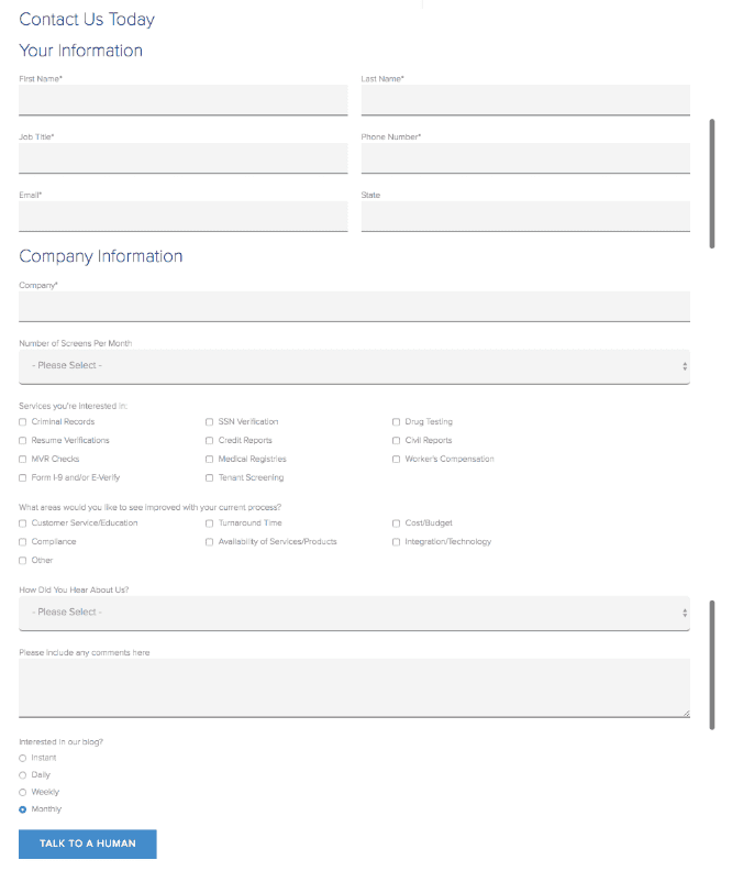
When it comes to contact forms, it can be pretty tough to try and get what you need from your site visitors without your form looking like War & Peace.
Unnecessarily long contact forms can be a massive turn off to site visitors who have made it that far, so it’s vital that you keep it short & sweet.
Research from 2022 found that contact forms with 3 fields (uncommonly short) had a conversion rate of around 25%. With 5 fields this decreased to 15%. And each subsequent field in the form significantly decreased conversion rate from there.
If you have long contact forms, you are tying one arm behind your back when it comes to conversion rate.
Reason #3 – Handing your contact info over feels like a big commitment
Contact forms feel like a significant commitment because the act of filling them out is pretty transactional.
Your site visitor hands over their personal data in exchange for a piece of information (this could be a guide, eBook or even a demo request.)
The problem is that most people are aware that the only reason they’re handing over data is so the door is opened for future communication between a business and a prospective buyer. Some may opt out of this idea entirely.
(If you haven’t got a checkbox on your contact form allowing users to opt out of marketing communications, we highly encourage you to do so!). Learn more about How to Collect GDPR-Compliant Data
Remember, it’s 2023. Data breaches are rife. Most users will not want to hand over their personal information without first establishing a foundation of trust or relevance.
This is why it’s so important for modern brands to sharpen their buyer’s journey before their traffic reaches a stage of commitment. You can do this by…
- Making information that could influence a buying decision easily available.
- Tailoring conversion journeys.
- Understanding where your visitors are in the funnel.
- Serving dynamic or personalised content based on these factors.
Reason #4 – Anyone can fill out your contact form
You’ve probably already experienced this yourself.
Contact forms are famous for receiving spam or even low quality lead submissions because of the fact that anybody can fill one out.
We hate to plug our product halfway through a blog, but Leadoo can actually help with this.
Your buyer’s can be routed down a variety of different options in place of a contact form, sequentially disqualifying leads that don’t meet your pre-set criteria. It’s also much harder for a bot to complete a dynamically loaded in-page bot, compared to say a contact form specifically housed on its own URL.
Below is a demonstration of one of our Visual Bots.
Give it a go for yourself and see Leadoo’s lead qualifying magic first hand. ✨
Reason #5 – No urgency to convert.
Another big issue with contact forms is the lack of any level of urgency or pressure to finish converting. Once a visitor begins engaging with your form, the decision to convert is left completely in their hands.
A traditional contact form offers no level of interactivity or urgency to convert there and then. Meaning your site traffic can abandon the conversion process pretty early on.
If this sounds pretty similar to what you’re experiencing, a contact form might not be the best option available for you.
Fortunately, Leadoo’s conversion kit offers all the tools you need to engage & activate your web traffic.
You can serve as many dynamic prompts within a Leadoo bot conversation as you like. And the nature of conversational tech itself creates much more of a sense of urgency and responsiveness, compared to a traditional contact form URL.
Reason #6 – Contact forms lack personalisation
Another area that contact forms miss the mark is failing to tailor the user experience based on where your visitor is at in the buying journey.
A popular conversion myth is that any two conversion journeys are the same. We know that this isn’t the truth, so why treat them like they are?
Visitors who return to your site post discovery might be further along in their decision making process and might find your contact form too generic and not fit for purpose.
In contrast, offering a more personalised approach such as offering content or recommendations based on how much your visitor knows, or what content they have engaged with onsite, can help you maximise conversions.
There’s a lot of research proving that modern buyers now EXPECT and even demand personalisation. Give it to them with tools like Leadoo Personaliser.

Reason #7 – You don’t get any data or insights from contact forms
The lack of critical data or insights is one of the biggest drawbacks when it comes to contact forms.
For example, if a thousand visitors hit your website today but only a few convert, contact forms won’t help you figure out why the rest didn’t (or how close they came to actually converting.)
Plus, if for any reason your visitors bounced due to any number of the problems listed above, you’re left with no actual valuable insights, making it guess work to try and fine tune or optimise your website experience.
This brings us to our final point…
Reason #8 – There are better options out there!
You’re probably wondering what contact form alternatives are out there. Fortunately, there’s plenty of great products to choose from that can help you improve your chances of landing conversions from your website.
Let’s talk about Leadoo.
We help businesses convert more of their web traffic by transforming your website’s user experience using interactive content in place of legacy methods (contact forms, we’re looking at you…👀)
But what does this have to do with contact forms?
Our Conversion Kit offers a range of on-page tools that you can use to replace your contact form, offering unique experiences to every site visitor based on factors such as:
- Where they’re at in their journey.
- What they already know about your brand.
- Whether they’re ready to make a buying decision.
Not only do they look a lot better (example of our InPage bot below…)
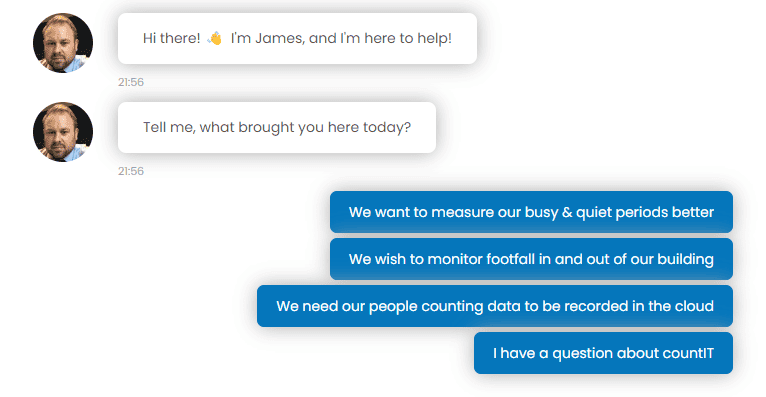
They also give you all the relevant data & insights needed to provide better conversion journeys.
We’ve helped ICE InsureTech triple their quarterly website leads; vCreate increase weekly leads by 75%; and D-Tech increase their conversions by 546%.
If you’re not using Leadoo, you’re missing out 😉
